
I chose to do my infographic on sexual violence against youth.
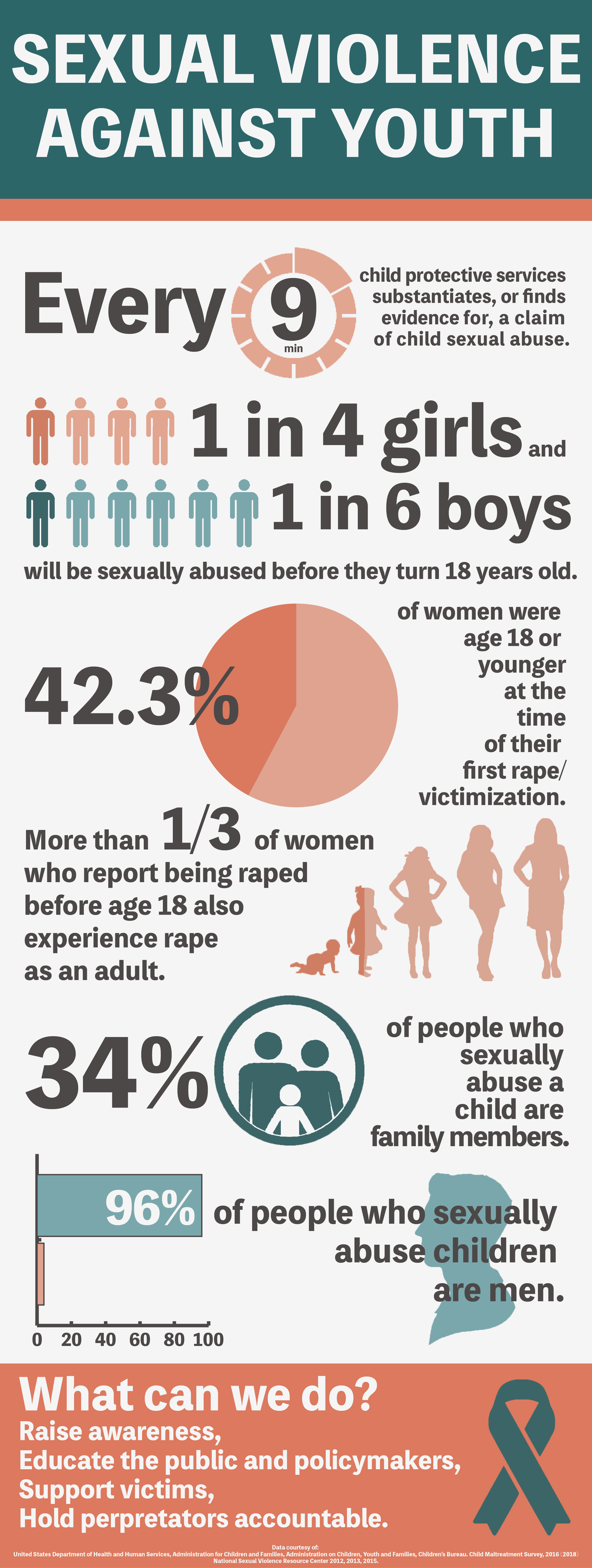
“Every 9 minutes, child protective services substantiates, or finds evidence for, a claim of child sexual abuse.”
I started out with the first data point in order to begin my narrative with a sense of urgency — a need to race against time. I visualized this through a clock icon that emphasized nine minutes.
I then moved into presenting data points about the youth victims of sexual violence. This set up the issue that needs to be addressed.
“One in four girls and one in six boys will be sexually abused before they turn 18 years old.”
I thought that the second data point would be best visualized using people icons, so I darkened one of the people to stand for the “one” victim in the number of girls and boys who are sexually abused before the age of 18.
“42.3% of women were age 18 or younger at the time of their first rape/victimization.”
For the third data point, I created a pie chart. At first, I had two pie charts — one that represented the fraction of female victims under the age of 10 and another that represented those between the ages of 11 and 17. However, Nick suggested that combining the two data points would create a more memorable statistic, and I agreed, so I did so.
“More than ⅓ of women who report being raped before age 18 also experience rape as an adult.”
For the fourth data point, I found an image that represents a baby girl growing into an adult. The original image showed the continuation of growth through elderhood, but I chose to erase all by five of the figures because 1.) the data point only represents females under the age of 18 and 2.) five figures made it easier to represent a third. I did so by darkening roughly 1.6 of the female figures.
I then moved into presenting data points about the perpetrators of sexual violence against youth. I thought this would be a good way to lead up to the call to action at the very bottom of the infographic because these data points show who should be held accountable.
“34% of people who sexually abuse children are family members.”
I chose to represent the fifth data point using an icon of a family with a child. I feel that the circle shape of the icon contrasts the security and comfort that is supposed to come from family with the confinement that comes with being unable to speak up about sexual abuse especially when it is instigated by a family member. I also think that it serves to unify the infographic visually because every other data point utilizes circular shapes.
“96% of people who sexually abuse children are men.”
The final data point is visualized using a bar graph. I also took Nick’s advice for this one; a bar graph is one of the ways in which the huge disparity between female and male sexual abusers can be most dramatically represented. I thought there was too much blank space with just the bar graph and the text, so I kept the silhouette icon of a male’s profile that I had in one of my earlier drafts and placed it behind the text.
The last panel of the infographic contains some things we can do to stop, or at least better deal with, sexual violence against youth as well as the sources I gathered my data points from: the National Sexual Violence Resource Center and the U.S. Department of Health and Human Services. To the right, I included a teal color ribbon, which is the designated color for sexual assault awareness. This teal color was also the inspiration for the color theme of the infographic. I also wanted to be able to represent females and males without the use of the typical blue and pink, which I thought were a bit too bright for the topic, so I went for an orange color to complement the teal.
